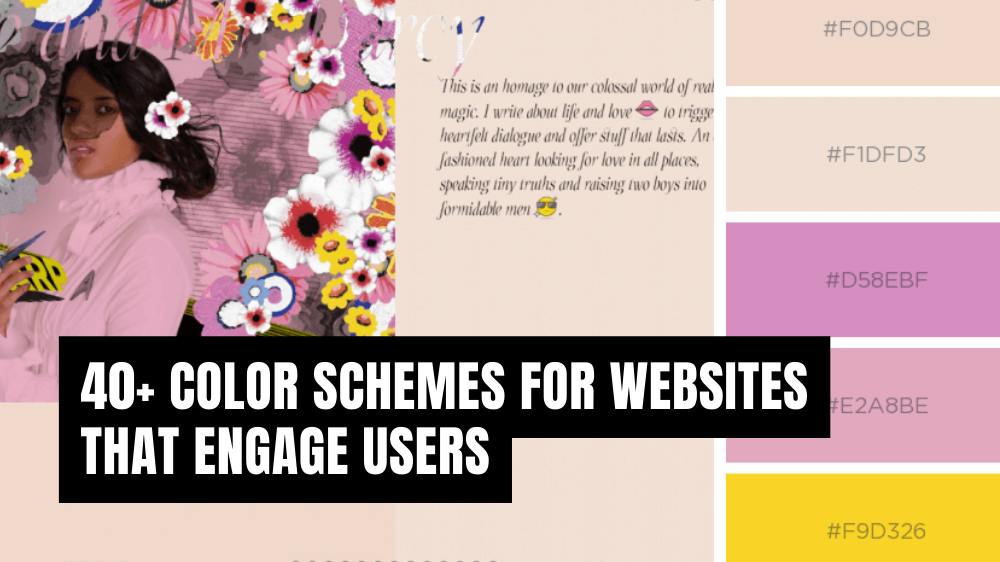
The Psychology of Color: How Hues Influence User Experience on Websites
The psychology of color plays a crucial role in shaping user experience on websites. Different hues evoke distinct emotional responses and can significantly influence how users perceive a brand or interact with a webpage. For instance, blue often conveys trust and professionalism, making it a popular choice for financial institutions, while red is associated with excitement and urgency, frequently employed in sales promotions. By understanding these associations, web designers can strategically choose color schemes that enhance navigation and drive conversions, ultimately creating a more engaging user experience.
Moreover, the impact of color psychology extends beyond simple aesthetics; it influences user behavior in various ways. Research indicates that up to 90% of snap judgments made about products can be based solely on their color. As a result, organizations must consider how colors can align with their brand identity and target audience expectations. For example, a healthcare website might utilize calming greens and blues to promote feelings of safety and care, whereas an e-commerce site may benefit from vibrant colors that spark engagement and action. By harmonizing color choices with user expectations, websites can significantly enhance their overall usability and appeal.
Choosing the Perfect Color Palette: A Step-by-Step Guide for Web Designers
Choosing the perfect color palette is crucial for web designers, as it sets the overall tone and mood of a website. The right colors can enhance user experience and convey the brand's message effectively. A step-by-step approach can simplify this process. First, consider the psychology of colors; different hues evoke various emotions and reactions. For example, blue typically conveys trust and reliability, while yellow can represent optimism and energy. Identifying your target audience will also help you choose colors that resonate with them.
Next, create a mood board to visualize your ideas. Collect images, textures, and colors that inspire you, and analyze how they work together. Using tools like Adobe Color or Coolors will further assist in generating harmonious combinations. As you fine-tune your palette, aim for a balance between primary and secondary colors. A good rule of thumb is to use one dominant color, one or two complementary colors, and a few accent colors. By following these steps, web designers can confidently select a color palette that enhances both aesthetics and functionality.
What Are the Best Colors for Increasing Conversion Rates on Your Website?
When it comes to increasing conversion rates on your website, color psychology plays a crucial role. Different colors evoke various emotions and can significantly influence a user's decision-making process. For instance, red is often associated with urgency, making it a popular choice for clearance sales and time-sensitive offers. Blue, on the other hand, conveys trust and reliability, making it ideal for brands such as banks and financial institutions. To effectively harness the power of colors, consider testing a range of hues across your site elements, including call-to-action buttons and banners.
In addition to red and blue, green is another effective color for boosting conversion rates, especially for eco-friendly products or services. It promotes a sense of nature and wellness, appealing to environmentally conscious consumers. Furthermore, orange has been shown to create a feeling of enthusiasm and excitement, encouraging users to take action. Ultimately, understanding the psychological impact of these colors can help you design a website that not only attracts visitors but also converts them into customers. Remember to continually analyze your site's performance and tweak your color choices based on user behavior and feedback.
